Skip to content

Many liberties

A highly flexible design system for Sana Kliniken,

which gives the more than 50 locations maximum individual leeway

- without neglecting what connects them.

Case Sana Kliniken wirDesign

Sana Kliniken – CD-Relaunch

Industry 
Health 

Services 
Design analysis 
Corporate design development 
CD implementation 

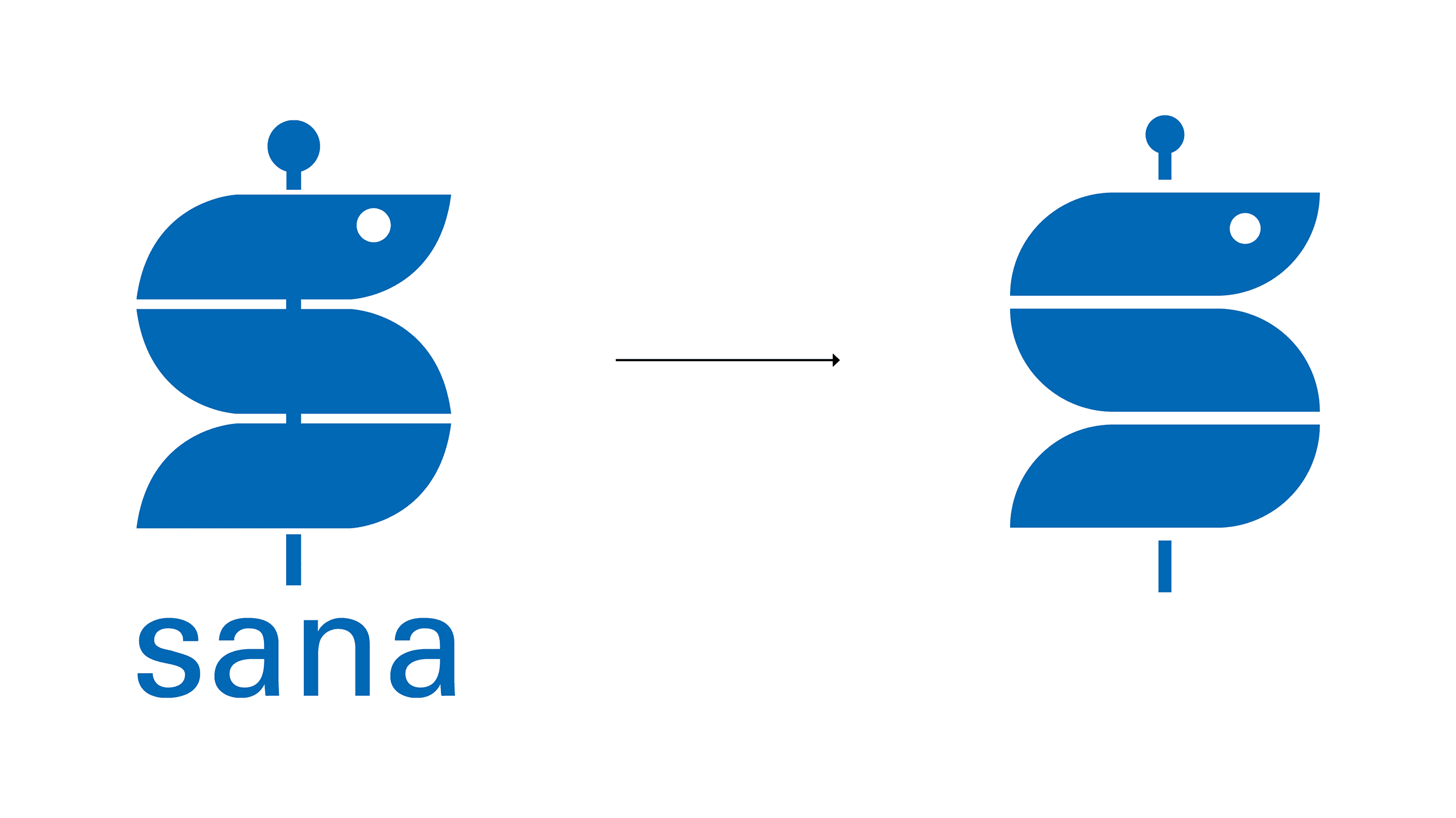
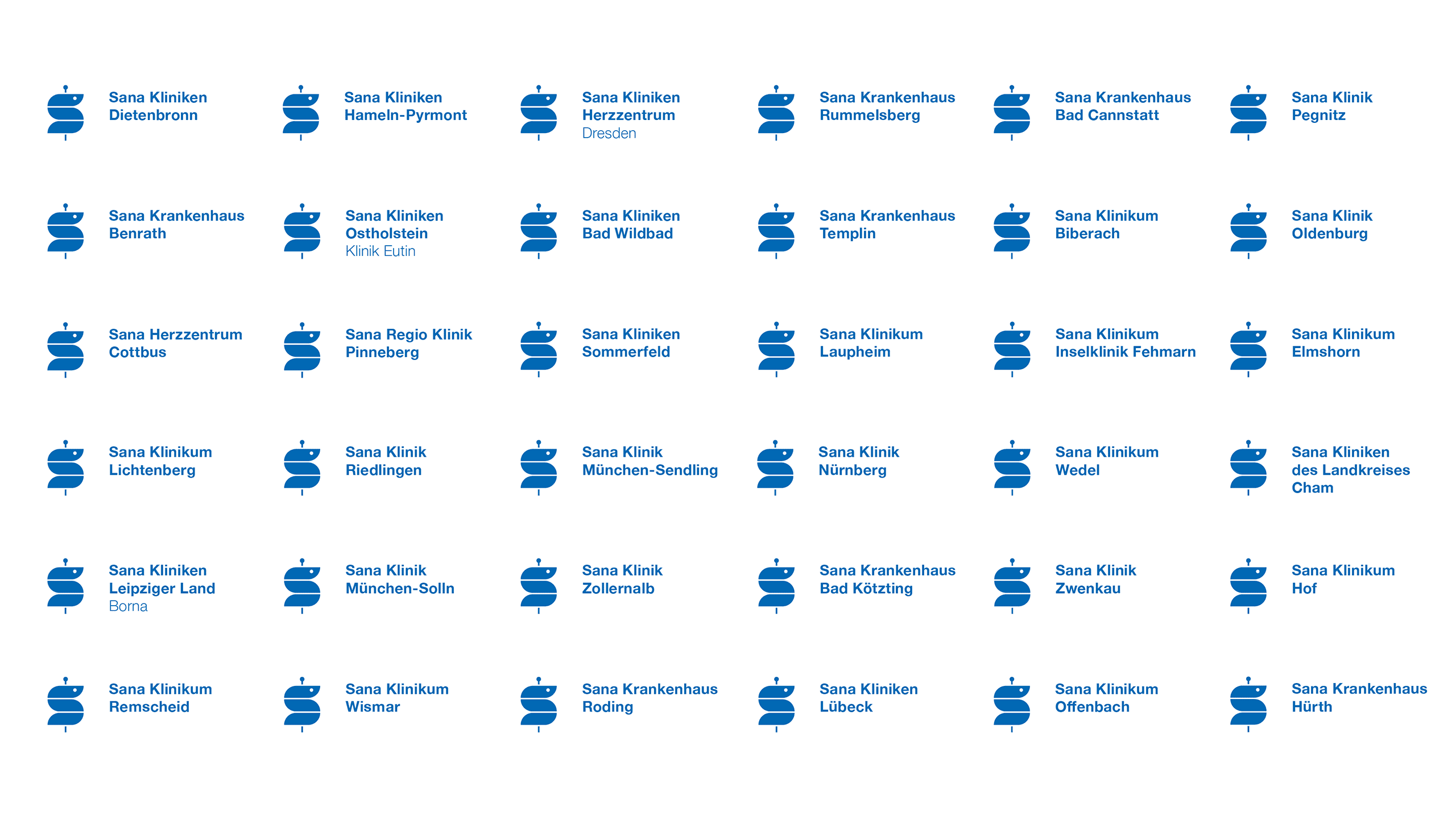
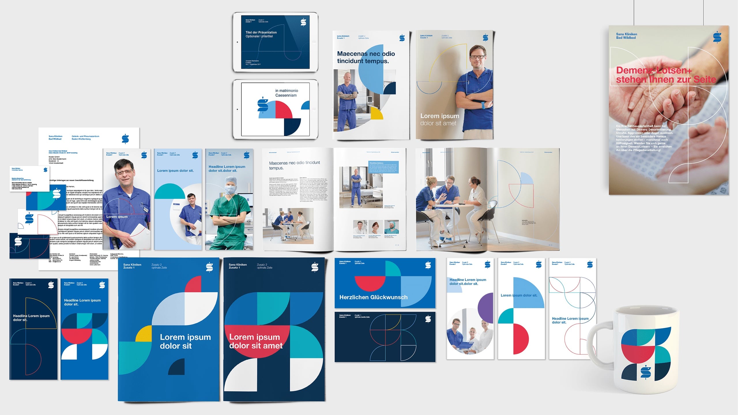
As Germany's third-largest private hospital group with more than 50 hospitals, Sana Kliniken AG is one of the most important providers in the field of integrated healthcare services. 

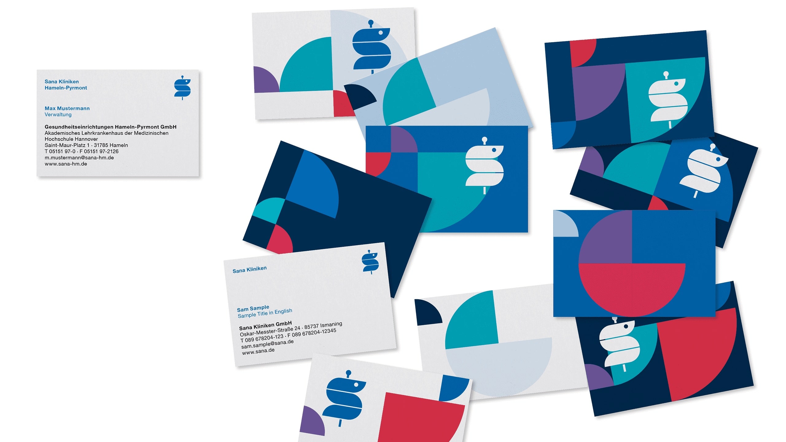
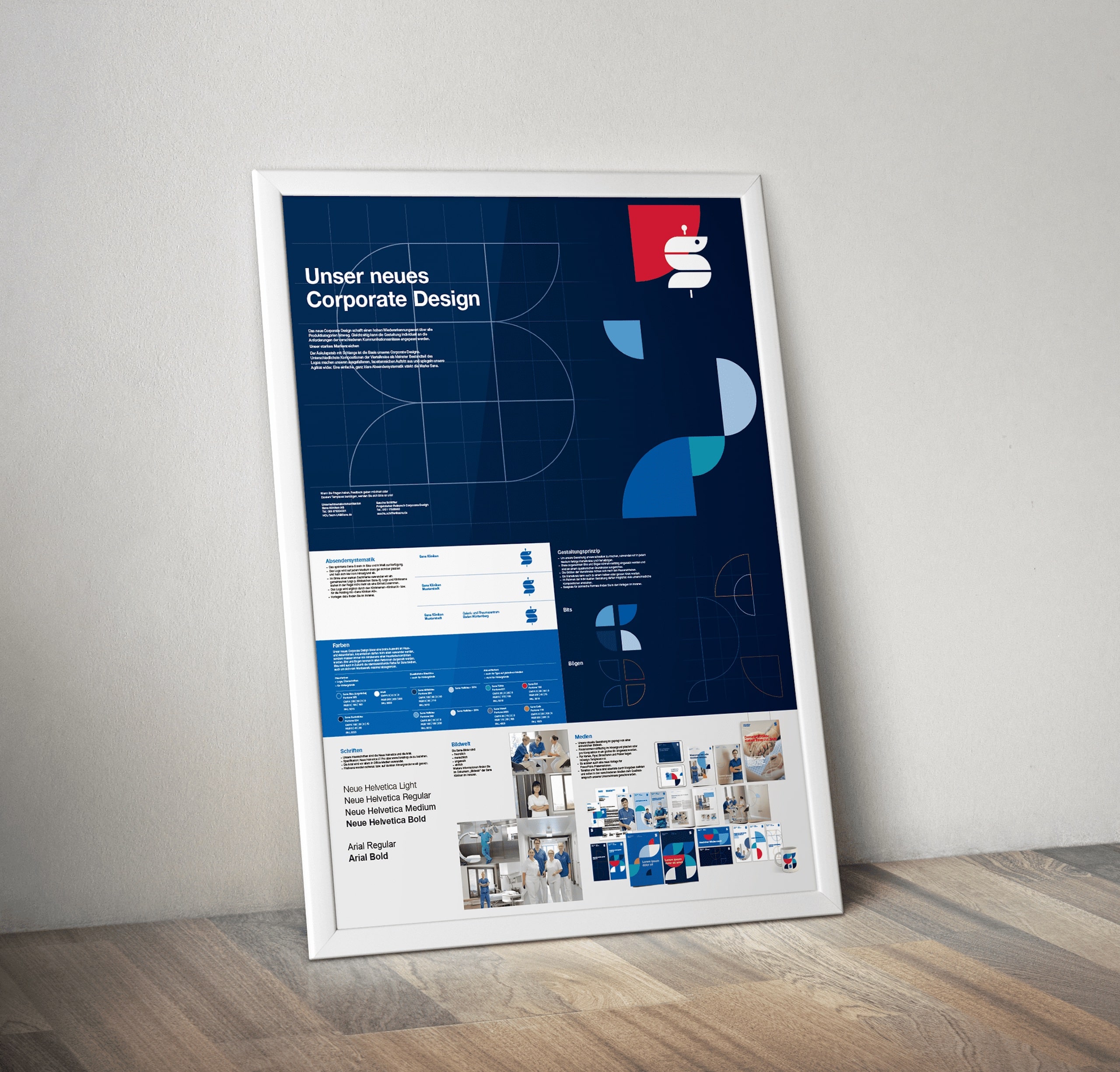
Minimal guidelines and abandonment of rigid design regulations offer maximum leeway in the daily use of the new brand appearance. This is how the design can be adapted individually to the requirements of the various communication events. 

Case Sana Kliniken wirDesign

Umbrella brand system

Clear and simple

A uniform sender system strengthens the Sana brand. The common »Sana-S« logo has been slightly optimized and is supplemented by the respective clinic name.

Case Sana Kliniken wirDesign

Design principle

Flexible and playful 

The rod of Aesculapius with snake is the basis of the CD. Derived from the "Sana-S", quarter circles and quarter arcs form the smallest component parts of the new design principle. In different compositions, the »bits and arcs« create a multifaceted, distinctive appearance that has an emotional and approachable effect. 

Case Sana Kliniken wirDesign